
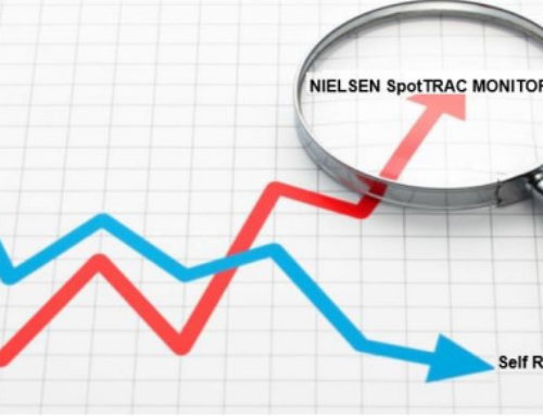
Developing a comprehensive evaluation system for your PSA program is critical to measuring your success and being able to justify the worth of your efforts. In the old days getting reliable evaluation data was difficult if not impossible. However, we now have the A.C. Nielsen SpotTrac electronic tracking system for TV and even a system that can track radio in major markets that provide very reliable evaluation feedback.
Since broadcast television accounts for the lion’s share of PSA exposure, we spend more time tracking and analyzing TV data than that resulting from other forms of media exposure. Following are just a few of the key trends we measure for client campaigns, most of which rely on electronic data provided by A.C. Nielsen’s SpotTrac electronic tracking service.
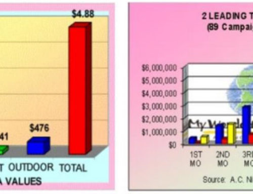
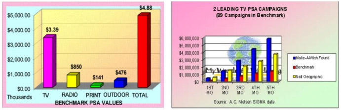
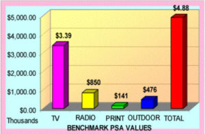 Campaign Benchmarks
One of the most frequently asked questions posed by clients is: “How is my campaign doing….?” And of course, we are thinking….” compared to what….” since it is a relative question. To provide a meaningful response, we create campaign benchmarks for each media type that permit us to compare any given campaign against a standard.
The data in this graph also provides meaningful feedback for future budgeting purposes. While it is true that radio and print are going to help you reach discrete audiences, the benchmark clearly shows that broadcast television is going to generate the lion’s share of reach for your campaign.
 Benchmarking also gives us some basis of comparison as the campaign matures over time. It allows us to watch trends develop and apply corrective actions when we see a campaign performing significantly under the benchmark.
Daypart Analysis
One of the most frequently repeated misstatements about PSAs is that “they are only aired during junk time”‘ which is usually referred to as very late in the evening and early AM.
As this graph shows, that is clearly not the case. The Nielsen SpotTrac data breaks down PSA usage by different times within a 24-hour period. For the campaign shown in the graph, nearly two thirds of PSAs aired in the best dayparts, which start with the Early AM daypart, up to the first half of the Late Evening daypart (10PM-midnight).
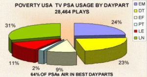 Depending upon your particular target audience, you can track the percentage of PSAs aired during the times when your target audience is most likely viewing TV, which provides an important quality indicator. For example, women (yes there are still stay-athome moms – just ask Proctor & Gamble) are heavy TV watchers during the day.
Spot Length Analysis
Perhaps the second most widely held misperception about PSAs is that stations use mostly shorter spot lengths. Again, the data shows just the opposite.
Referring to our benchmark again, SpotTrac data from campaigns which included sixties in their package, shows that stations using sixties ranged from 53% on the low end, to 61% on the high end, with an average of 56%.
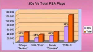 This graph has rather obvious implications to your creative team. If they are producing only shorter length spots, you are missing an opportunity to register a more compelling message that is possible through longer lengths.
Perhaps more importantly, a :60 is worth twice a :30 and four times a :15, meaning you will generate much greater value for your campaign, to many people the most important determinant of success. Finally, if you are using a tag with a website or an 800 number in your PSAs, you need the longer length messages to adequately register the information on the tag. The good news: it does not cost you a dime more to distribute several spot lengths to stations and what you will get in additional airtime far outweighs the additional editing time required.
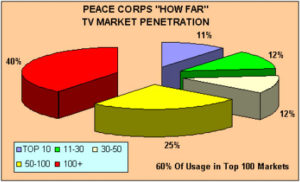 Analysis By Market Size
Another way to look at PSA data is to analyze usage by market size. Nielsen uses DMAs – Designated Market Areas which range from 1 (New York being the largest population center) to 212 the least populated market.
By examining the percentage of your PSAs that are being used in various markets, which are correlated to population, you can determine areas where your exposure is strongest or weakest. This data provides feedback for taking corrective action in markets where your exposure is weak or nonexistent. In the case of the Peace Corps campaign, nearly two-thirds of all exposure occurred in the top 100 markets which comprise about 80% of the U.S. Population.
Demographic Analysis
Electronic monitoring data – specifically Nielsen’s Post-buy package, which works in tandem with SpotTrac, can permit you to measure impact upon a specific target audience. By examining demographics, you can track the number of gross impressions delivered to these audiences.
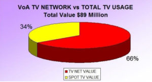 Usage By Type
It is important to know as much as you can about the type of TV outlets that are using your PSAs, and what they contribute to your total exposure. You can analyze usage by media type, i.e, broadcast versus cable TV, or local stations versus networks.
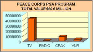
For most PSA campaigns we do outreach calls to all national networks to pitch the client’s PSA to them and this technique has generated tens of millions in additional value shown in this graph.
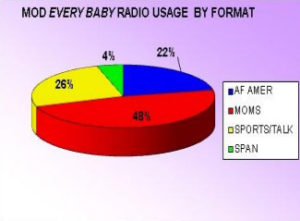 Usage By Format
What are the formats of the radio stations using your PSAs and are they the ones that reach your primary audiences? Perhaps you are interested in reach a youth audience, in which case you want to examine the number of college stations using your PSAs.
Or, examine how well you are reaching ethnic audiences such as Hispanic, African-American or other minorities. By analyzing the level of usage among different types of stations, you can determine if you reached your objectives.
Level of Response
Perhaps the most widely held misperception about PSAs is that “they just don’t work… if you want to get exposure for your issue, you have to buy the time.” Once again, TV PSA data paints a different picture.
Unknown to many PSA planners, PSA campaigns can even generate excellent levels of response. For years the primary method the Peace Corps used to communicate its message to young prospective volunteers was a national PSA campaign.
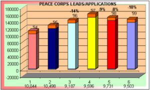 They carefully tracked the source of all incoming leads and applications and shown here they generated 782,000 leads during the six-year period we worked with them, resulting in 58,588 applications.
The foregoing graph also shows another interesting trend demonstrating the efficacy of PSA campaigns. In the first five years, they distributed two campaigns a year which are the years when leads were on the rise. In 1998- 99, they scaled back to only a single campaign and experienced a reduction in both leads and applications.
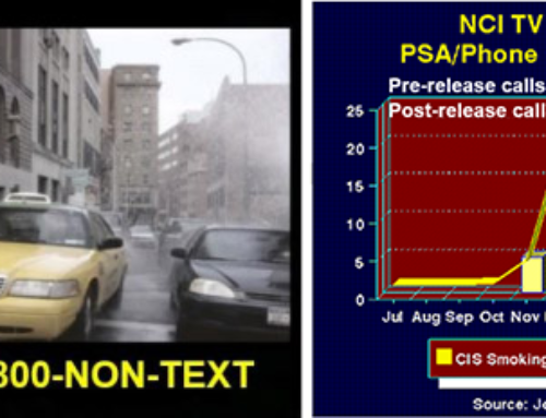
One of the most definitive studies showing the impact of a toll-free number used in TV PSAs was done by the National Cancer Institute (NCI) which measured calls to its Cancer Information Service.
NCI distributes public information via a number of different media and was trying to determine the impact of TV PSAs in general and the affect they had on phone calls to its toll-free number.
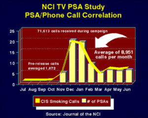 In the months prior to the release of the TV PSA, phone calls averaged 1,872 per month as shown by the flat yellow line for July-November. After the TV PSAs were distributed over 71,000 calls were logged during the eight month test period, or an average of 8,951 calls per month. Also, as the graph shows, there was a direct correlation between calls and level of PSA activity.
By using a dedicated 800 line and tagging your PSAs with the phone number or a website URL that is specifically set up to track “hits” resulting from your campaign, you can get excellent feedback on PSA effectiveness, as well as demographic data on typical responders.
 Or, you can ask for people to write for specific pieces of literature that have been prepared exclusively for use with your PSA campaign and track the number of requests you receive.
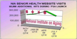
Measuring Website Traffic
By examining website traffic pre-campaign and post campaign, you can see if your PSA campaign is driving traffic to your website as shown in this graph.
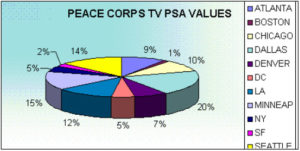 Geographic Tracking
PSA usage data can be broken out to demonstrate where you are getting the most or least exposure by field office, chapter, district or some other geographic area as shown in these graphs.
Obviously there are parts of the country where there are more media outlets than others, or you may have distributed more PSAs to certain markets or regions.
However, by tracking usage by some discrete geographic method, interesting patterns begin to emerge and by sharing this trend data with your community partners, hopefully proactive tactics can be employed to reverse negative patterns.
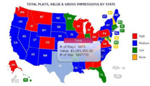 Interactive Mapping
The old adage that a picture is worth a thousand words certainly applies to PSA evaluation. To demonstrate where our clients are or are not getting exposure in various parts of the country, we use an interactive map such as shown here. It shows TV PSA usage according to four different levels of exposure using various colors. If you hold your cursor over any state, the usage data for that state will appear on screen.
By sharing this type of data with your community partners, it helps involve them in your campaign strategy, and shows specifically where they need to concentrate future media contacts.
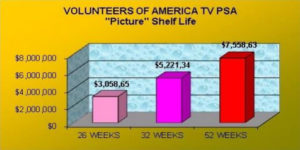 Confirmation of Shelf-Life
Before electronic monitoring data was available, everyone estimated the shelf life of PSA campaigns to be about 12 weeks, because that’s when bounceback cards began to dwindle.
As shown in this graph, a campaign for Volunteers of America generated 55% more value at the end of two years compared to the value after only tracking for one year.
Program Effectiveness
Perhaps the most important reason for evaluating any campaign is to substantiate the overall effectiveness of your program. If you can’t prove the effectiveness of your program to your boss, or whoever else is funding your campaign, it probably won’t survive in these lean times.
There are lots of ways to do this:
- Produce a monthly management summary of the dollar values generated, the number of PSAs aired, and the number of stations and markets where your PSAs were used, the types of audiences reached and gross impressions. (We do this for all our client campaigns.)
- Circulate your PSA evaluation data to all stakeholders in your organization who have any interest in your brand image… board members, volunteer leaders, senior management, field public affairs personnel and funding sources.
- If you use an 800 number in your PSAs, you should be able to track the number of phone calls generated, website visits or literature requests received.
- Compare key trends data from one campaign to another, from one year to another to determine whether you are making progress over time.
 Calculate the advertising equivalency value – the value you would have spent if you bought the airtime – and compute a cost-benefit ratio by dividing the production and distribution costs for your campaign by the amount of exposure received.
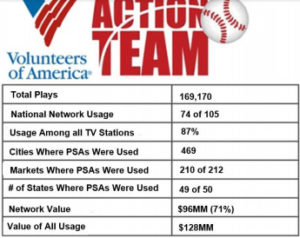
- Compile data on the longterm program impact such as that shown in the Action Team graphic.
 And most importantly, remember that evaluation data should be actionable. Compiling evaluation data just for the sake of having numbers is a meaningless exercise if you don’t use the data to change the way you develop future strategy.
1 Article has been updated with later evaluation data and trends.


Leave A Comment